Berkshire Hathaway Brand & Web Redesign
Personal Project
The Goal: Enhance user experience for seamless web navigation and rebranding a global conglomerate with a modern, professional identity.
The Challenge: Restructure the website’s information architecture to create a clear and intuitive way to navigate the vast amount of content. The existing structure was disorganized, making it difficult for users to find relevant information efficiently. Additionally, the brand and logo lacked a cohesive identity, requiring a complete redesign to convey professionalism and align with the company's stature as a leading global conglomerate.
My Role: UX Designer, Researcher
Tools: Adobe Photoshop, XD
*Desktop view is optimal
Research
Approach:
Due to the nature of this personal project, I did not have access to external users for research. Instead, I took a heuristic approach, using myself as a proxy user. With no prior knowledge of Berkshire Hathaway, I performed a UX audit, heuristic evaluation, and an empathy mapping exercise to analyze the existing website’s usability and structure.
Key Findings from UX Audit:
Business Objective Disconnect:
The website lacks an "About" page, leaving the company’s purpose and scope unclear.
The primary goal of informing users about the business is obscured by overwhelming links and disorganized content.
Navigation Issues:
No navigation bar or breadcrumbs to help users understand where they are.
Long link trails create confusion and disrupt user flow.
Target Audience Mismatch:
Wealthy, seasoned investors (ages 55–60+) and mid-level investors (ages 30–45) are the primary audience, but the site does not cater to their expectations of professionalism and ease of use.
Heuristic Evaluation Results:
Visibility of System Status: Poor. Site doesn’t inform user where they’re at or show user how to navigate back to previous page.
System & Real World Connections: Poor. The lack of icons, buttons, or other indicators hinders the site’s intuitive navigation.
User Control & Freedom: Poor. Does not allow user to exit actions or undo them. This can lead to frustration.
Consistency: Poor. Cluttered and has no clear design system or structure; overwhelming link-based design.
Error Prevention & Recovery: Poor. No intuitive way to avoid or correct navigation errors.
Recognition Over Recall: Poor. Users are forced to recall where specific information is located.
Aesthetic & Minimal Design: Poor. Lacks brand identity and site is made up of an overwhelming amount of information to mine through.
Help & Documentation: Poor. Site is link heavy and confusing. The ability to narrow down a search for specific information is lacking.
Empathy Map Summary:
Based on my experience as a first-time user:
Thinks: "Where is the information I need? This feels chaotic."
Feels: Confused and overwhelmed by the lack of guidance.
Says: "Why is there no structure or clear direction? Where can I find what I’m looking for?"
Does: Spends excessive time clicking through random links and guessing where specific information is.
Logo Rebrand
Berkshire Hathaway has many different logos for its various subsidiaries, but its main logo remains unchanged since its original 1939 launch. It utilizes Times New Roman in cobalt blue. The logo is dated and has no real brand identity.
Logo Goals:
To maintain Berkshire Hathaway's traditional corporate aesthetic, I selected AdornS Serif Regular as the primary typeface and refined the blues to a more sophisticated navy. Inspired by the Berkshire Hathaway Specialty Insurance logo, I designed an original brand mark to strengthen the company’s identity. Additionally, I implemented an analogous color palette to create a cohesive and polished visual experience.
Lo-Fi Wireframes
Homepage:
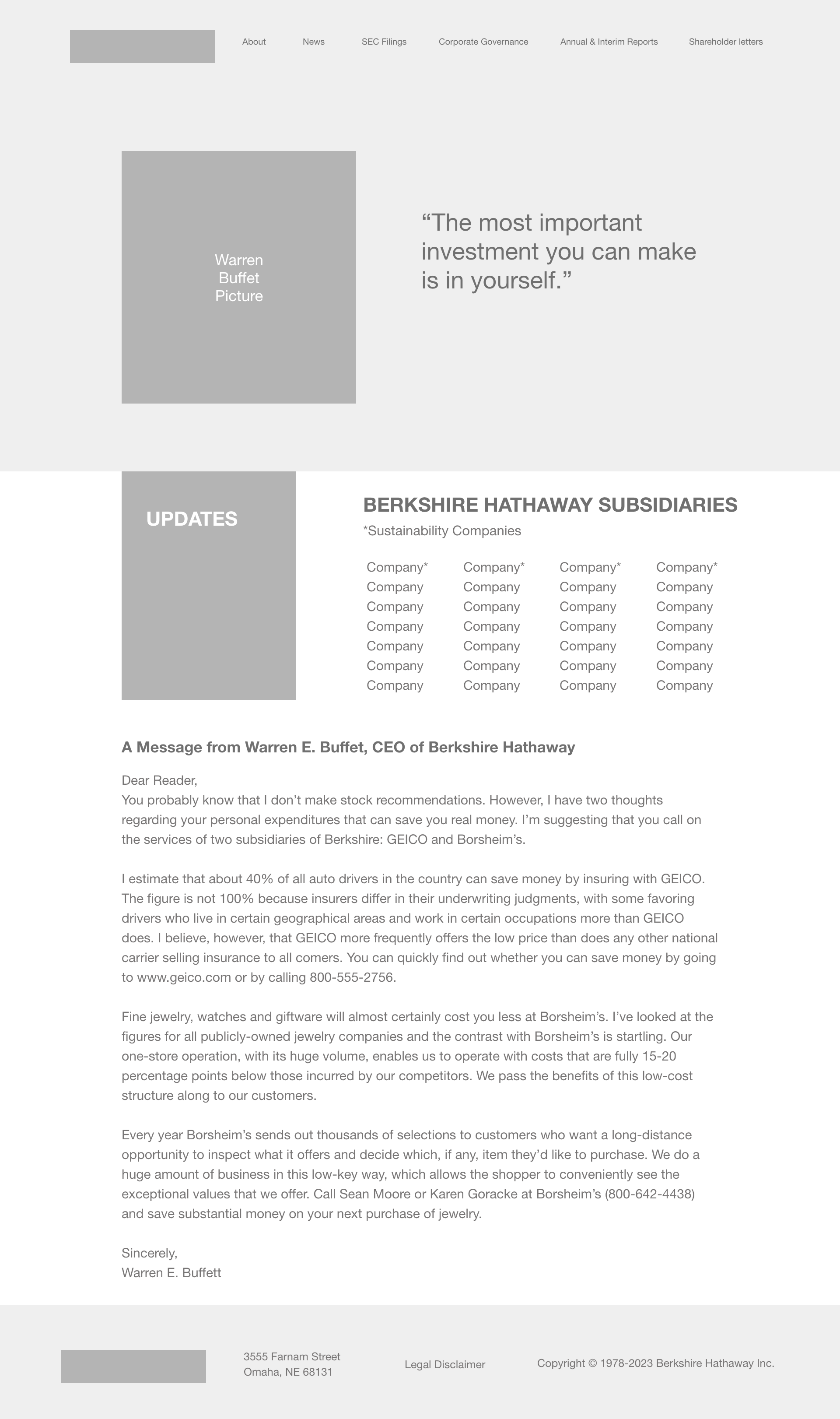
The homepage was designed to provide quick and easy access to all Berkshire Hathaway subsidiaries. To create a more personable and welcoming experience, I included the message from Warren Buffett towards the end of the page alongside a photo and quote in the header.
About Page:
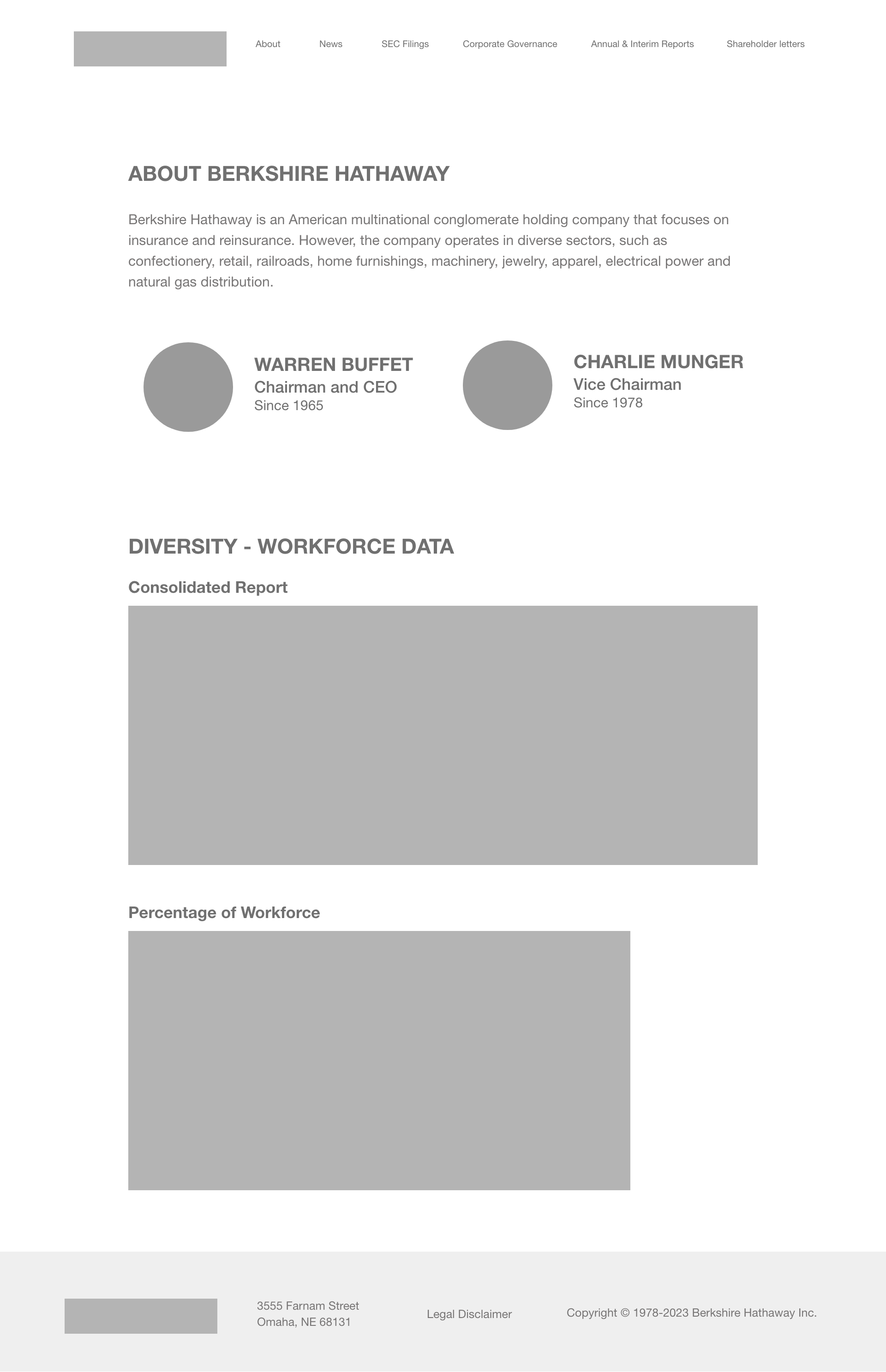
Recognizing the importance of introducing the company’s leadership, I created an "About" page to highlight the chairmen. This page also includes a link to Warren Buffett’s book, offering users additional insight into his philosophy and expertise.
Content Organization:
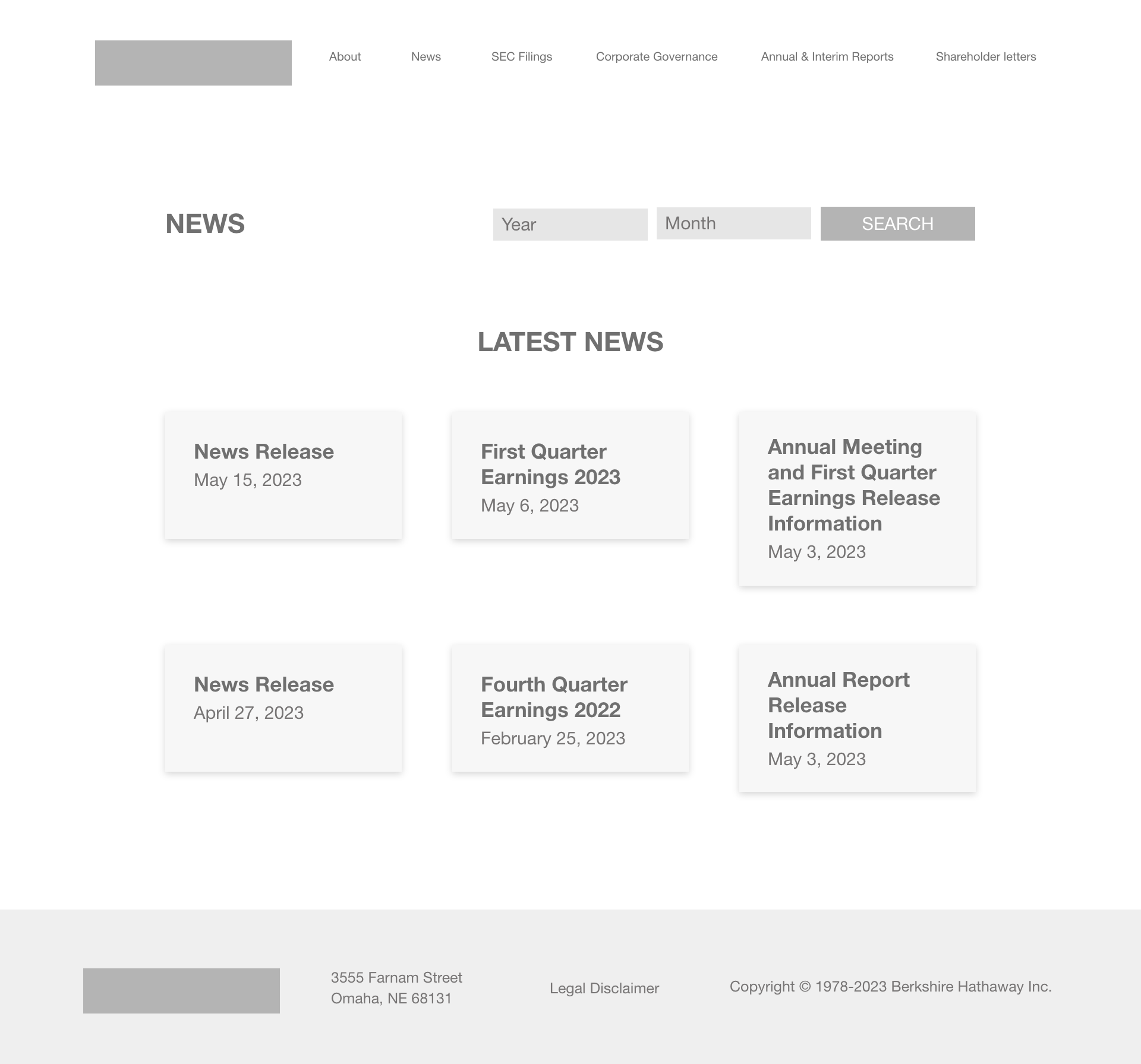
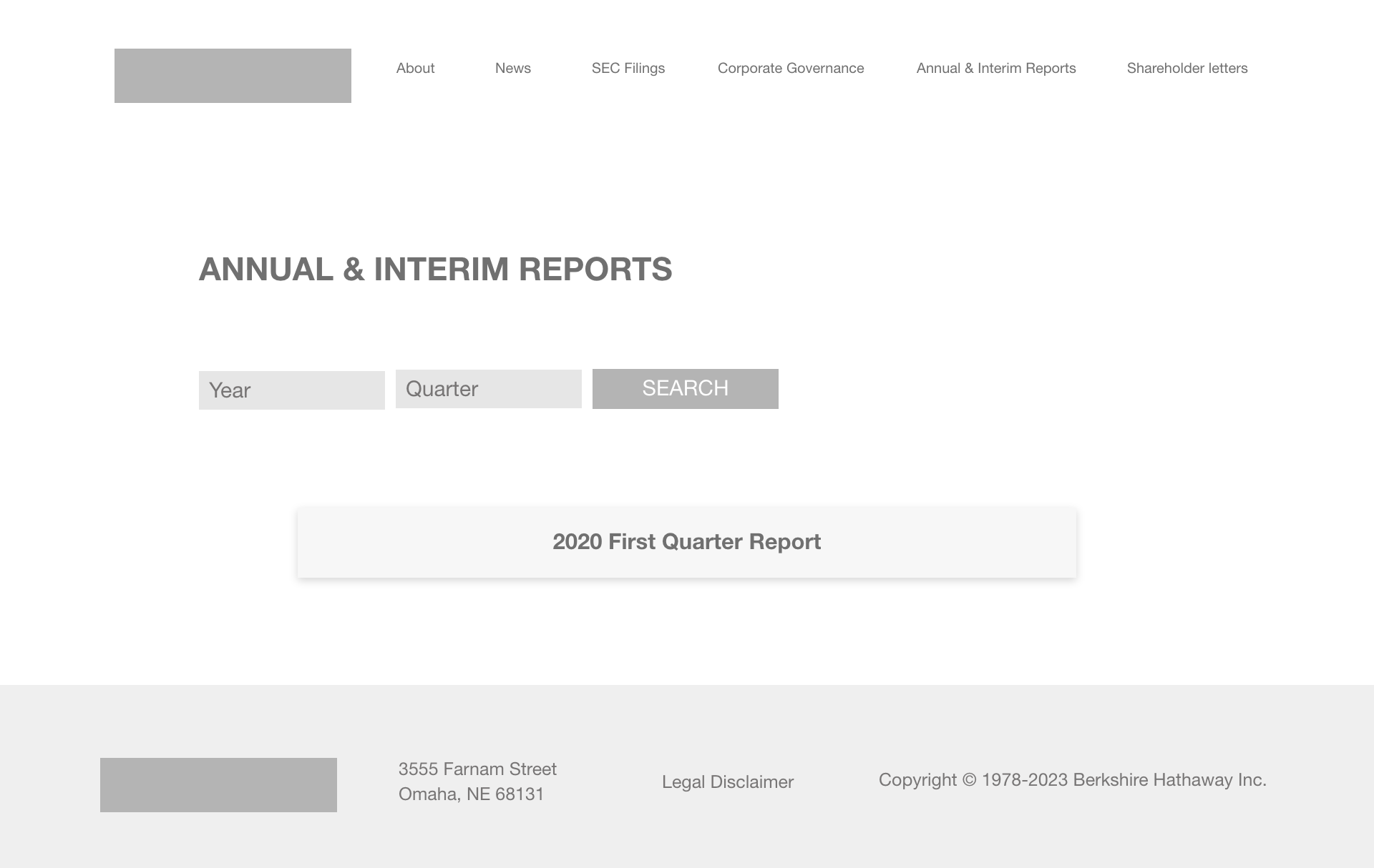
To improve usability, I structured the website into clear categories: Corporate Governance, Reports, News, and Letters.
Corporate Governance: This page consolidates essential information, including stock details, investor presentations, and helpful links, creating a centralized resource for corporate data.
Reports, News, and Letters: Given the extensive archive of materials dating back to pre-2001, I implemented filterable searches, allowing users to efficiently locate relevant articles, reports, and letters. This approach enhances navigation and ensures an intuitive user experience.
Final Prototype
After several iterations and refinements, I successfully achieved my goals of improving the website’s usability and creating a cohesive brand identity. By restructuring the information architecture, implementing intuitive navigation, and modernizing the branding, the final prototype delivers a user-friendly experience while maintaining Berkshire Hathaway’s professional corporate image.
*Desktop view is optimal


