
Case Study — 02
EduBridge: Closing the Post-Admission Gap for First-Gen Students

- Role
- Product Designer & Researcher
- Timeline
- Personal Project
- Tools
- Figma
01
The Challenge
First-generation college students make up 1 in 3 U.S. undergraduates, yet only 27% graduate within four years (compared to 42% of their continuing-generation peers). While dozens of apps help students apply to college, almost none support them once they actually arrive on campus. Without family experience to lean on, first-gen students often face imposter syndrome, financial aid confusion, and isolation—leading to higher dropout rates.
The Goal: Design a lightweight, accessible mobile companion that demystifies college logistics, breaks complex tasks into manageable steps, and connects first-gen students with relatable peer support.
02
Constraints & Scope
To ensure EduBridge could realistically serve under-resourced students, I established strict technical and experiential guardrails from day one:
- Hardware & Connectivity: Must run smoothly on older Android devices with spotty Wi-Fi and offer offline access for core guides.
- Low-Lift Architecture: Zero budget for expensive third-party APIs or custom AI model training.
- Tone of Voice: Warm, empowering, and jargon-free—feeling like a helpful upperclassman rather than a bureaucratic university portal.
03
Research & Competitive Audit
Through secondary research into first-gen student retention and an audit of four existing platforms, I uncovered a clear market gap: existing tools treat college admission as the finish line.
| Competitor | Core Strength | Critical Gap |
|---|---|---|
| Common App | Streamlined application submission | Support ends completely post-admission |
| RaiseMe | Gamified micro-scholarships | Focused exclusively on high schoolers |
| Scholly | Easy scholarship filtering | Zero academic advising or emotional support |
| YouVisit | Interactive virtual campus tours | Lacks actionable guidance or next steps |
04
Translating Insights into UX Strategy
- Insight: Financial & Academic Jargon Causes Paralysis → UX Decision: Translate institutional terms into plain language and break overwhelming processes (like FAFSA renewal) into bite-sized, sequential checklists.
- Insight: Imposter Syndrome & Isolation → UX Decision: Pair practical tools with relatable student stories and low-pressure peer connection spaces.
- Insight: Device & Bandwidth Limitations → UX Decision: Prioritize ultra-simple navigation, small asset sizes, and downloadable offline summaries.
05
Ideation & Feature Prioritization
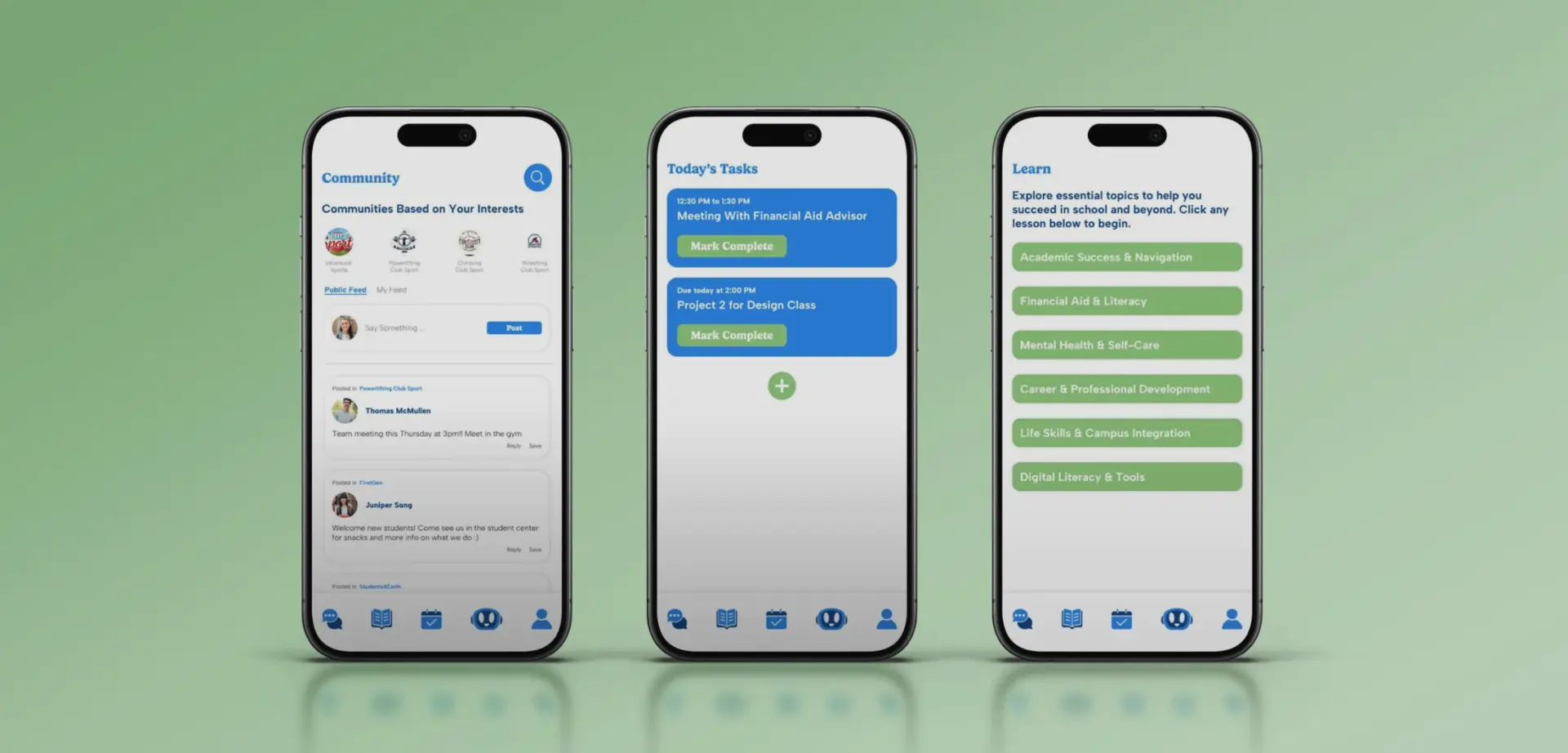
To respect the low-budget, low-bandwidth constraints, I prioritized high-impact, low-engineering-lift features:
- Adaptive Onboarding: Allows students to select their preferred language and school type (e.g. college/university, trade school, still deciding) to tailor their dashboard immediately.
- Bite-Sized Learning Modules: 3-minute, visual explainers covering hidden college norms (e.g., academic success, understanding financial aid, mental health support), complete with downloadable offline PDFs.
- Actionable Task Tracker: A clean, to-do list that allows students to keep track of their busy schedules.
- Guided FAQ Assistant (Rule-Based): Instead of a costly, hallucination-prone generative AI, I designed a structured decision-tree chatbot that answers common questions instantly and routes sensitive issues to human campus advisors.
- Peer & Club Directory: A curated feed highlighting campus clubs and first-gen mentorship groups, lowering the barrier to finding community.
06
Design Validation: Heuristic Self-Audit
Because I did not have access to a recruited pool of first-gen students during this sprint, I conducted a structured Heuristic Evaluation. My goal was to stress-test the flows for users who may have lower digital literacy or high anxiety around making mistakes.
07
Key Audit Findings & Design Iterations
- Error Prevention & Recovery (Issue Identified & Fixed): Early wireframes of the FAQ assistant mimicked a live messaging app, risking user confusion over whether they were speaking to a real counselor. The Fix: Added a clear automated-assistant disclaimer and pre-written prompt chips to prevent blank-page anxiety.
- Aesthetic & Minimalist Design (Validated): High-stress users abandon cluttered interfaces. I enforced generous whitespace, a restrained color palette, and WCAG 2.1 AA compliance (verified color contrast, clear focus states, and 48px+ mobile tap targets).
- Flexibility & Efficiency of Use (Validated): Students juggle classes, jobs, and family duties. Users can consume lessons in 60-second chunks on the bus or download the full module summary in one tap for offline reading.
08
Reflection & Next Steps
Designing EduBridge taught me how much constraints sharpen product decisions. Stripping away heavy AI integrations and complex social features forced me to focus on clarity, offline reliability, and emotional reassurance—the things first-gen students actually need most.
If moving forward into development, my next steps would be:
- Usability Testing with First-Gen Freshmen: Recruit 5–8 incoming students to test the onboarding and FAFSA module flows, measuring task completion time and comprehension.
- Defining Success Metrics: Track 30-day retention, module completion rates, and the percentage of students who successfully connect with a campus advisor or club within their first month.
Best viewed on desktop.
Next Case Study
CareCanopy: A Family-Built Platform for Caregiving